Semiotic analysis and problems we encountered.
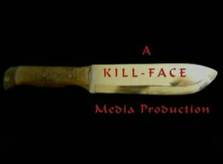
Our film starts with our production logo. We chose a knife to signify the genre we would be working in and red font colour to signify blood. The serif font connotes the horror genre because it is more Gothic and could relate to blood dripping.
We used a fading transaction so the production logo would fade into the establishing shot, a low Dutch angle shot of two strips of light from a door frame.

We used a low angle shot to make the character who comes to the door appear more domineering and powerful. We used a Dutch angle shot to signify that something isn't right, a technique used in Bride Of Chucky (Ronnie Yu 1998)

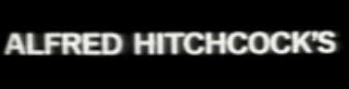
The music is slow with long drawn out notes. We chose these to build tension and anchor the preferred reading that the film is of the horror genre. We recorded the sound of footsteps and edited them to make them gradually increase in volume, another tension building technique and signify someone is walking towards the door. One problem with this was that when we added the actual footsteps from the shot some background noise is audible however we could not rectify this. We got the idea for the font and colour for our titles from Saul Bass' work with Alfred Hitchcock, especially on the film Psycho (1960) in which the titles are a white sans serif font similar to the one we used.
We used a differing sound in the music which cuts across the other notes when the footsteps are approaching the door to create more build up. Once the door is opened we had the male actor pause before walking down the stairs to build tension. This is a device we found though our genre research that is used in Halloween (John Carpenter 1979) and Friday The 13th (1980 Sean .S Cunningham) Where Jason and Micheal Myres do this. We dressed the character in dark clothes, similar to the boiler suit Micheal Myres wears in Halloween (John Carpenter 1979) and heavy boots to emphasis the noise of the footsteps to seem menacing.
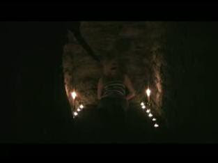
We kept the characters face covered to introduce narrative enigma to our production. We found from our research of common codes and conventions that in the opening scenes of horror films we need to provide enough exposition to introduce the audience to the narrative, but to include some narrative enigma to encourage them to carry on watching. We provided the exposition by showing the house and how the character was kidnapped however left to characters unnamed so as to introduce narrative enigma. The character then walks down the stairs, past the camera and the shot fades to a close up shot of a blonde teenage girl who has back tape round her mouth. This shot is blurry and unsteady.

We found it hard to use the tripod to film this shot due to space restrictions however if we were to film it again I would have done more to ensure the shot wasn't blurry. The framing of this shot could also have been improved as the girls head isn't directly in centre of the frame. The shot zooms out to reveal the girl is tied up in a hole with candles around her. This was difficult to take as we couldn’t get the archway in the shot.

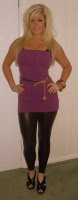
We chose to have candles as they proved effective in achieving the effect we wanted, eerie with connotations of Gothic horror and rituals. We dressed the girl in tight revealing clothes and specifically chose a blonde actor with a curvy figure to reflect what we had picked up on in our genre research. We wanted to use the stereotypical "Scream Queen" image, comparable to Drew Barrymore's role in the first scene of Scream (Wes Craven 1996)

We first considered using a brunette actress as a counter-type which could help draw in an audience from class groups ABC1 however we decided to concentrate on attracting out target audience (C2DE) and settled on the blonde actress. We added the sound of a heart beating to build tension by making the audiences heart beat become irregular therefore making them feel unconsciously tense, a technique used in the opening of Scream (Wes Craven 1996) The differing drawn out sound comes over the music again, which stops and the shot cuts to a long shot of a house in black and white. We stopped the music to make the heartbeat more prominent to increase tension and to connote that the girl is having a flashback. This is the reason we chose to have the house and the shot of the alleyway in black and white because it is believed that people dream in black and white.
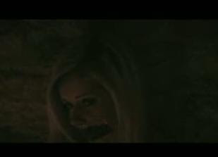
The shot zooms slightly with the heartbeat still playing then cuts back to a long shot of the girl tied up in the hole. The shot cuts back to the house zooming slightly more then back to the same shot of the girl, and then back to the house and to the girl again. The shot cuts to a long shot of the girl walking down an alleyway on her mobile phone. We chose the alleyway as our location because it had over hanging trees, creating a daunting effect used in the opening scene of Scream.

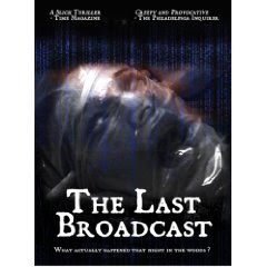
We also used a black and white effect on this scene to give anchorage to the fact that the girl is having a flashback. The shot cuts back to the girl in the hole then back to her in the alleyway, then back to her in the hole. When the shot cuts back to the alleyway a man dressed in dark clothes with his hood covering his face comes from behind the wall and puts a plastic bag over the girls head. We got this idea from The Last Broadcast (Stefan Avlos 2000) the shot cuts back to the girl in the hole, then back to the alleyway where the girl is shown screaming and being dragged off screen.
Whilst the girl is being dragged off the audio stops for a couple of seconds before the shot does which is a problem we were not able to rectify, but would if we had the chance to re shoot by having the actress scream louder for a few seconds longer to ensure she is out of shot before the screaming stops. Ideally we would have used a boom mike to pick up the sound that the camera didn't. We hadn't originally planned to inter cut the shot of the girl laid in the cellar and the flashback of her in the alley however the majority of our audience feedback criticized us for having long continuous takes and from our research we found shorter cuts are more likely to appeal to our target audience therefore we re edited our piece to create shorter takes. Looking back we should have also added a shot of possibly the girls eyes flickering or a slight movement to signify that she is dreaming.
On the last cut back to the girl we added the sound of the footsteps coming towards over the heartbeat. We then cut to a point of view shot from the murderer. Ideally we would have liked to have used a steady-cam to do this as used in Halloween (John Carpenter 1979) http://www.youtube.com/watch?v=vKLlcI0cWI0 it allows the camera to move slowly and smoothly however as we could find no suitable alternative the camera work here is quite shaky. We used a high angled shot looking down on the girl to increase her vulnerability. We used the hand held shot to signify social realism, creating a sense of verisimilitude with the audience. This could help draw in a higher social grouping (ABC1) because of the social realism genre being seen as higher culture rather than popular culture. This is also one of the reasons we decided to use stills of the house, we experimented with using a camera flashing sound to create some sense of a police investigation for example, similar to The Texas Chain-saw Massacre (Tobe Hooper 1974) (http://www.youtube.com/watch?v=M4i4EBZzHGM&feature=related). This would create a Docu-drama which is more likely to attract a higher culture audience however we found it did not fit with our text and interrupted the tension.

We had the actor breathing heavily to appear menacing and at this point started the beeping noise of a heart monitor. We framed this shot carefully to show the knife silhouetted by the candles to emphasize the relevance of the knife being a symbolic phallic object, symbolizing the sexual slant to the genre.
We then cut to a close up shot of the girl regaining consciousness. This shot is also badly framed and the girls head is not centred.
We added more heavy breathing from the murderer over the top as the girl regains consciousness. As the girl starts to scream and the murderer moves towards her we increase the speed of the heart monitor sound and had the murderer breathing heavily and grunting. We used a shot reverse shot technique, firstly using a shot of the girl, then the murderer, then cutting back to the girl. This is an example of continuity editing which we picked up on in our preliminary task. We framed the shot of the murderer so you cannot see his face, leaving narrative enigma as to who this character is. We had the murderer moving towards the girl and the heart rate monitor quickening in pace. We cut some of the sound of the girl screaming from our other coverage shots and added it again as it didn't sound as realistic on our final take. We then cut to the title of the film with the sound of the girl screaming and the noise of a flat line to signify that she is dead. We decided to keep the violence off screen because it can be hard to make it look realistic, some of the most successful slasher films have used this strategy as it can be worse imagining what is happening for example Halloween (John Carpenter 1979) Friday The 13th (Sean. S Cunningham 1980) and My Bloody Valentine (George Mihalka 1981)

Our title is similar to Saul Bass' work on Psycho (Alfred Hitchcock 1960) With the font being similar and the vertical stripes instead of horizontal. We chose these stripes and the colour to signify the genre, Slasher.
Target audience and Representation.
We decided on our target audience through research into our chosen genre. We found that horror films generally aim to pull in the young youth audience (15 to 35) and socio-economic groupings C2DE. When researching common codes and conventions we found they achieve this by centring plots on teenagers. Adults and figures of authority such as sheriffs are often portrayed as useless and it is often left to the "Final Girl" to fend for herself. The "Final Girl" is something else we came across in our common codes and conventions and something we had to consider when targeting gender. Often introduced to drawn in the female audience is the tough, resourceful "Final Girl" typically a virginal brunette such as Laurie Strode (Halloween) juxtaposed with "Scream Queens" typically blonde and sexually active (Drew Barrymore’s character in Scream)
We decided on our target audience through research into our chosen genre. We found that horror films generally aim to pull in the young youth audience (15 to 35) and socio-economic groupings C2DE. When researching common codes and conventions we found they achieve this by centring plots on teenagers. Adults and figures of authority such as sheriffs are often portrayed as useless and it is often left to the "Final Girl" to fend for herself. The "Final Girl" is something else we came across in our common codes and conventions and something we had to consider when targeting gender. Often introduced to drawn in the female audience is the tough, resourceful "Final Girl" typically a virginal brunette such as Laurie Strode (Halloween) juxtaposed with "Scream Queens" typically blonde and sexually active (Drew Barrymore’s character in Scream)

Therefore we decided to have teenagers in our production, we chose actors who were the actual age of our characters to create verisimilitude. We could have introduced older characters to relate to a higher age group and class grouping such as in Hannibal (Ridley Scott 2001) however we decided it would be more suitable to work with popular culture instead of higher culture. Our product doesn’t show a wide representation of ethnicity's or disabilities however it does not only target a narrow Caucasian audience. Films such as The Ring (Gore Verbinski 2002) do not show any disabilities or ethnic minorities and still succeeded.
Because of the lack of dialogue in our production we could not convey any nationalities well and sexuality’s were also a problem.
We decided to use the typical "Scream Queen" but if we had continued our piece past two minutes we would have used the idea of a "Final Girl" We dressed the girl in tight low cut clothing and specifically chose an actress with blonde hair to convey this stereotype.
We decided to use the typical "Scream Queen" but if we had continued our piece past two minutes we would have used the idea of a "Final Girl" We dressed the girl in tight low cut clothing and specifically chose an actress with blonde hair to convey this stereotype.
Progression from preliminary task.
My preliminary task highlighted the importance of planning in my work. My group left various shots out in the task because of not planning thoroughly enough, which made me more conscious of planning carefully for our final cut so as not to repeat this mistake. I preferred working in a larger group instead of a pair because it was easier to decide on ideas. In a larger group you can decide by a majority vote whereas in pairs it is harder to come to a decision.By researching our genre and codes and conventions we found this made it easier to come up with ideas, we didn’t find any audience feedback for our preliminary task which we found extremely useful in improving our final cut.
By using i movie 06 tutorials http://www.apple.com/support/ilife/tutorials/imovie/ we found we were far more experienced in using the software to improve our final cut. We over dubbed sounds of footsteps and screaming to make the final cut more realistic.
We were also more experience in using the camera for example every time we shot footage we made sure we had set the white balance, something we did not do in our preliminary task. We used tripods in our final cut as we found the footage in our preliminary task far too unsteady. Consideration of framing was also more important as we found from our preliminary task because it improves the look of the film overall.
Production companies and marketing strategies.
Our film would be distributed by a smaller independent production company who often work with films with similar budgets to ours (Around £1 million) such as Warp X or Working Title when they had first been established. We would be more likely to work with Warp X as they have worked with films from Yorkshire such as Donkey Punch (Oliver Blackburn 2008) and This Is England (Shane Medows)
If we were to release our film our most likely distributor would be a company such as lionsgate international. They have a strong link with horror and have worked with UK films such as The Decent (Neil Marshall 2005) We decided this by reseaching various distrobution companies at www.bbc.co.uk/dna/filmnetwork/relatedlinksexhibitionanddistributionfeatures
We produced a poster as advertisement for our film based on the opening credits of Psycho as this would draw in fans of Psycho.

No comments:
Post a Comment